ChewsySpring 2025
Explore new cultural foods with confidence and ease.
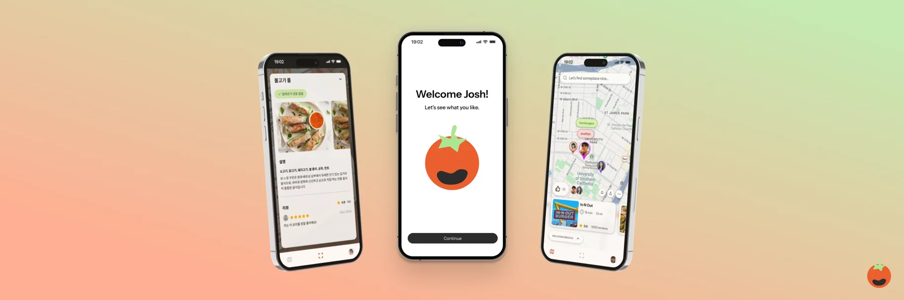
Chewsy is a social, AR-powered mobile app that lets people with dietary restrictions explore food freely.
As part of a 24-hour design challenge through CreateSC, I teamed with three others to create something that digitizes tangible experiences. As my first designathon, we went through the entire design process from ideation to prototyping — check out our Devpost submission here.
Problem Space
Over 300 million people suffer from severe food allergies — myself included.
This makes it difficult to navigate exploring new foods, both within one’s own culture and learning about new ones. As someone who’s always actively trying new foods around LA, and planning on studying abroad, this culinary barrier bars me from freely exploring and understanding my own cultural identity.
Food is community: with other obstacles such as language barriers and allergy shame, the spirit of exploration and community often gets buried.
HMW enable those with dietary restrictions to confidently try new foods?
Solution
Three features carry the app, each one aimed at a different point where a dietary restriction stops someone from ordering: what they can eat, what the menu actually says, and where their friends already go.

Create your profile with dietary needs and preferences. Personalization is key throughout the Chewsy experience — every user has unique needs, and this feature ensures their food journey is tailored accordingly.
Ideation
We began our process by whiteboarding and moodboarding initial ideas to explore visual and thematic directions, and identify common threads in our concept.
When we formed as a team, we all shared our love for exploring new foods and cultures. However, one problem continued to come up: the dietary restrictions that many people face when trying new foods.
Concept Validation
From there, we moved to FigJam to map out the user flow — detailing specific user actions, decision points, and outlining each individual screen of the app.
Midway through building our flow, we conducted user interviews to better understand what features and experiences users actually wanted. These insights helped us refine our flow and prioritize functionality that addressed real user pain points.
Wireframing
From these defined pain points and user flows, we started to wireframe, then moving from low- to high-fidelity screens of our core features.
Onboarding
I took the main lead on the onboarding process, designing an intuitive experience of filling out a user profile. To reduce the user’s cognitive load, I researched the user journeys of other apps such as Headspace and Yelp. I also tested various interaction design options and icon labeling to maintain the explore-centric feel of our brand identity.
Menu Scanner & Community Map
Given our time constraints, my other team members worked on our other core features: Chewsy’s Menu Scanner and Community Map. We rapidly iterated, focusing on feature placement and interaction design.
After our final designs, we prototyped them all in 3 user flows and ensured the user experience gave room to increased discovery experience and confidence.
Takeaways
Humanizing design is essential.
As someone who’s experienced allergy scares and reactions before, the premise behind Chewsy was important and personal. With the understanding that food opens the door to community, we anchored our core features to allow the user to discover and explore — ultimately making them more confident in expressing their dietary needs.
The design process is messy.
We spent a third of our 24-hour sprint ideating, ensuring that our concept was viable and necessary. Connecting the dots between our various ideas, it took us user interviews and stepping back to refine a solid problem space.
Surrounding yourself with talent is the most valuable vehicle for growth.
I worked with a team of others who are relatively more experienced and well-versed in design and sprint challenges. This sprint was where I could tangibly see myself grow as a designer. From learning new Figma shortcuts, to whiteboarding and user journey mapping, to extracting key features from our ideas: all areas that I have become more confident navigating to be a well-rounded and informed designer.